
Why The Row Bags Have No Logo: The Design Language Explained
Handle a bag from The Row and an absence is what you notice first. Nothing is printed as a monogram, no plaque is bolted to the front panel, and no oversized initial swings from a handle. The label was founded in 2006 by Mary-Kate and Ashley Olsen and named after Savile Row in London, and that reference is less decorative packaging than a construction brief. Cut, cloth and the hand finishing, not a badge, are what make a Savile Row jacket recognisable, and the leather goods inherit the same logic. Everything downstream is shaped by that decision: silhouette, hardware finish, lining and the way the bags sit on the observed 2026 market. What follows is a design-led row bags overview and not a shopping list, since it works through the specific choices that carry identity once the logo is removed.
Absence as the Argument
Stripping out the logo is not a neutral act, because a logo does quiet labour for a handbag. It states the price bracket at ten paces, flatters the owner by broadcasting the purchase, and lets a factory bury mediocre construction behind a famous symbol. Strip that away and each of those jobs must be re-assigned to something physical. The shape has to register at a distance; the leather has to look expensive to a stranger who cannot name the brand; the seams have to survive close inspection. It explains why the row bags are so frequently described as difficult to photograph and easy to recognise in person. The design language amounts to a series of substitutions, each one costing money that a printed monogram would have saved.
What Does the Monogram’s Job
Recognition on a row bag depends on three things: silhouette, proportion and construction. Silhouette is the outline you register before any detail resolves, and it takes over the work a logo typically does. Proportion is the outline’s internal rhythm, the relationship between width, depth and handle drop that makes one crescent shape look considered and another look generic. Construction is what confirms the first two once the bag is in your hands, through stitch density, edge finishing and the way panels meet. None of these can be bolted on late or applied as a sticker at the end. Because they are decided at the pattern stage, the row bags structured top handle the approach is costly to copy and difficult to fake.
Silhouette Does the Work of a Name
Shape names, not seasonal collections, organise the catalogue, and buyers use them exactly as they would a monogram. The four that anchor the line are Margaux, Park, Half Moon and the 90’s Bag, and each is a distinct geometric idea rather than a riff on one theme. The Half Moon is a shallow crescent, listed officially at 8 x 13.5 x 2.5 inches; published dimensions differ between sources, so take the figure as an official reference point rather than a settled number. At 10 x 7 x 7.5 inches with a five-inch handle drop, the Soft Margaux 10 has a squared, upright stance that no soft hobo can imitate. The Margaux Shoulder 12 extends to 14.75 x 9 x 5 inches with elongated tubular handles and narrowed gusseted side panels, a different animal entirely despite the shared family name. Learn to read these outlines and the row bag in front of you identifies itself without a word of branding.
A handful of silhouette cues are worth learning first, since they come back across the line:
- The Soft Margaux family: belted side gussets and protective metal feet
- Elongated tubular handles with signature adjustable buckles on the Margaux Shoulder 12
- The N/S Park Tote reads tall, narrow and upright beside the wider standard Park Tote
- A hinged frame closure with a hidden adjustable strap on the Bourse Clutch
- A shallow crescent on the Half Moon, cut far flatter than the conventional hobo
Every Number Is a Measurement
The second replacement for branding is arithmetic, and it is about as literal as it gets here. That number beside a model name is the bag’s width in inches; it is neither a collection code nor a marketing tier. Margaux 10, 12, 15 and 17 rise in exact inches, and so do India 10.00, 12.00 and 15.75, Agnes 12 and 15, Sofia 8.75 and 10, and Marlo 12 and 14. The convention hands buyers a shared vocabulary that needs no images, which matters for products that photograph almost identically across sizes. It also underlines the point of the design language, since the naming describes the object instead of dressing it up. Offer a buyer dimensions rather than a story and you are asking to be judged on the object itself.
Two Stamps, Deliberately Small
The bags are not unmarked in the literal sense; the marking is simply pitched to be found rather than seen. There is a small exterior stamp positioned low on the side of the bag, sized and placed so it blends into the leather instead of advertising itself. A second stamp sits inside, centred and crisp, reading the logo and the words Made in Italy. The interior mark shows up on the brand’s own product pages for the Half Moon, the Soft Margaux 10 and 12, the Margaux Shoulder 12, the Bourse Clutch, the Terrasse To-Go and the Large Slouchy Banana. The logic of that placement matches the rest of the row fashion vocabulary, in that the information is there for anyone paying attention and invisible to everyone else. Branding here is a footnote rather than a headline, and it is as close as the bags come to signing their own work.
The Luxury Is Turned Inward
Hardware is where most labels offset restraint elsewhere, usually with polished gold that catches light across a room. The Row takes the opposite route: palladium-plated fittings in a matte or brushed finish that deliberately refuses to shine. The result is metal that registers as weight and precision rather than jewellery, and it ages without the scratch map that mirror-polished plating develops. The same rule governs the linings, which are treated as materials in their own right instead of canvases for repeated logo jacquard. Nappa, lambskin, calfskin and cotton herringbone all do that work, among them the cotton herringbone lining in the Soft Margaux 10 and the full lambskin lining in the Margaux Shoulder 12. Look at the label’s shoes and the same restraint is there, with a plain last and an unadorned toe carrying the identity, which is the clearest evidence that the no-logo position is a house philosophy and not a bag-department decision.
What the Quiet Costs
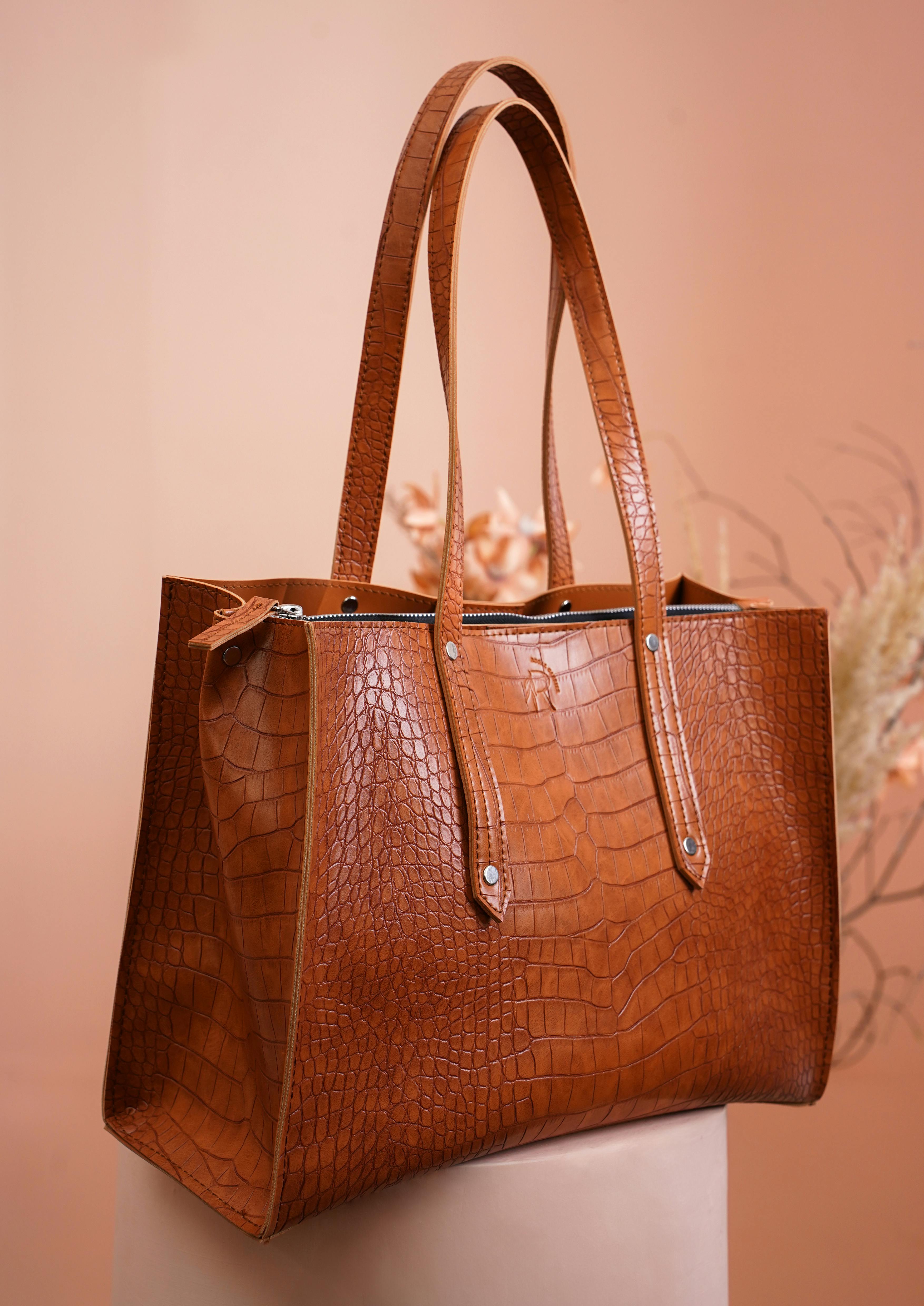
None of it comes free, and the observed 2026 market prices show where the money goes. A buyer is paying for pattern work, hide selection, hand-finished edges and hardware that has no decorative function, none of which produces a recognisable badge. Selling that proposition is hard, and it explains why the range runs unusually wide rather than clustering around a single hero price. The table below pairs anchor models with the detail that identifies them in place of a logo, at observed 2026 market prices rather than an official price list, which the brand does not publish. The right-hand column is the actual branding here, so read it that way. Stock, region and retailer all move the figures, so take them as a snapshot rather than a settled tariff.
| Model name | Price observed in 2026 | What marks it out instead of a logo |
|---|---|---|
| 90’s Bag | $1,090 | A softly slouched shoulder body with minimal seaming |
| Half Moon | $1,390 | A shallow crescent cut, listed officially at 8 x 13.5 x 2.5 in |
| Bourse Clutch | $1,590 | Frame closure on a hinge, nappa lining, hidden strap |
| N/S Park Tote Small | $1,550-1,620 | Upright body, tall and narrow, unstructured stance |
| Soft Margaux 10 | $3,650 | Belted side gussets, protective metal feet, herringbone lining |
| Margaux Shoulder 12 | $4,900 | Tubular handles with adjustable buckles and lambskin lining |
Reading the Design Language in Practice
If you are learning row handbags at this level, the useful skill is not memorising names but learning to look in the right order. Start with the outline, check proportion against the inch number in the model name, and then move on to the seams and the edges. Hardware comes after, judged on weight and finish rather than on shine, and the lining comes last, since it confirms rather than introduces. That sequence also protects you when a row bag is offered secondhand, since counterfeits reproduce shapes far more easily than edge finishing and matte plating. Take the same habits into any listing of the row for sale, where photographs flatten precisely the qualities that matter most. Learn the grammar once and the entire catalogue becomes readable, and that is what a design language without a logo asks of you.